Starting Monday, Nov. 2, you might notice that Goody has gotten a glow-up.
For months, we’ve been working behind the scenes to design a new logo that captures Goody’s essence: playful but not silly, premium but not exclusive, tasteful but not stuffy. Above all, we wanted to capture the joy that a Goody brings when it lands in your inbox.
Now, it’s finally here! We’re excited to share our new logo with the world.
The story behind the new logo
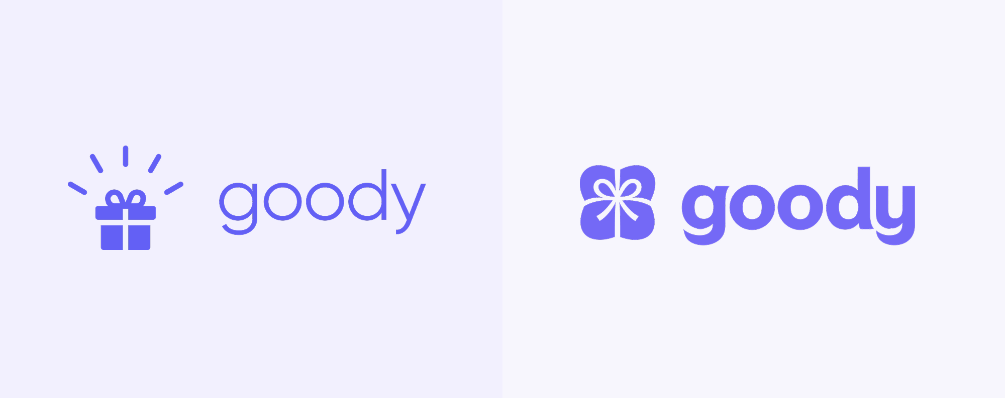
Goody launched as a consumer mobile app in 2020, and we’ve been using the same logo since then. Apart from some small tweaks, all of the fundamentals – the radiating gift box, the thin, lowercase wordmark – had been the same since our inception.
By 2026, it was clear we needed an upgrade.
“For a company as design-forward as Goody, the logo was not keeping up with our standards, or conveying the joy of receiving a gift,” says Katy Carrigan, Goody’s CEO.
That didn’t mean designing a new logo would be easy.
“The unique thing about Goody’s logo is that it’s really meant to make you look good,” says Mark Bao, Goody’s co-founder and CTO (and the designer of Goody’s original logo). “When someone receives a gift you’ve sent, we want them to look at Goody’s design, and implicitly feel that the sender was tasteful and thoughtful.”
The other big challenge? Finding a logo that would work across the incredible variety of use cases and customers that Goody serves. Goody’s logo needs to work for gifts that can range from affordable to luxe, and recipients who could be Gen-Z interns or Fortune 500 executives.
During our design explorations, we considered countless logo and icon directions – from a head-to-toe rebrand to an evolution of our original logo. We decided to evolve, rather than erase, the logo that has gotten us this far.
Our new mark was designed to hold two things at once: the warmth behind every Goody and the taste behind every gift in our collection.
- The wordmark — We retained the lowercase wordmark, while switching to bolder typography with subtly playful notes.
- The icon — After considering dozens of icons, from abstract starbursts to emoji-like gift boxes, we landed on an evolution of our original gift box. The gentle indentations suggest a package wrapped with affection by hand.
- The color — We kept the purple color scheme that has always defined us, but chose a more vibrant shade.
You'll start seeing it Monday, Nov. 2, across our platform, app, emails, and gift notifications.
Goody’s new logo was crafted by the legendary design house Day Job – whose work includes iconic logos like David Protein and Fly by Jing – in partnership with Goody’s in-house design team, Mark Bao and Bao Lam.
Sharper look, same Goody
The things you love about Goody aren't going anywhere. You can still send a gift in minutes, no address needed, and let recipients swap for something they love. More than 25,000 companies use Goody to thank employees, delight clients, and celebrate the moments that matter. Now it all just looks a little sharper.
Send a gift with the new Goody
About the author